Project 04

Drop-offs reduced in the credit card journey

Bajaj Finserv Co-brand Credit Card
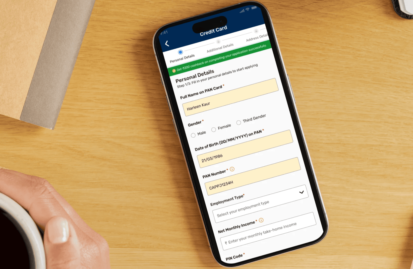
Improving stage completion by 10%

Reduce drop-offs at every stage of the appliation form

Project Overview

We took a look at the core user flow of the Bajaj Finserv Co-brand Credit Card and found that at users would not complete the application form. Our team took it up to optimise the user experience on the forms to address the pain points and motivate the user to complete filling the application.

Problem Statement

The application has 4 parts: Page 1: Personal details, Page 2: Additional details, Page 3: Occupation details and Page 4: Address details. We used Clevertap to monitor each stage and found that users were taking a lot of time to fill all details. The process was time-consuming.

Industry

Bajaj Finserv Co-brand Credit Card

My Role

Lead UX writer

Platforms

Mobile (iOs, Android), Website

Timeline

January 2023- December 2023

Persona

Ashutosh Rana

Cab driver

Ashutosh is a cab driver in the city of Pune. He works for 12-15 hours in a day. He lives with his wife, mother and son on the outskirts of the city.

Age: 37

Location: Pune

Tech Proficiency: Moderate

Gender: Male

Goal

A good credit limit for his mother's medical expenses

Quick and simple application process

Guidance or assistance with difficult concepts

Frustrations

Too many steps and details to fill

Unclear communication around error/blank fields

Has to restart application from page 1 after drop-off

Process

01. User Research

Conducted user interviews with 15 participants to understand their frustrations.

Analyzed user's video recordings of sessions to pinpoint where users dropped off in the process.

Benchmarked against to identify best practices for checkout flows.

01. User Research

Conducted user interviews with 15 participants to understand their frustrations.

Analyzed user's video recordings of sessions to pinpoint where users dropped off in the process.

Benchmarked against to identify best practices for checkout flows.

01. User Research

Conducted user interviews with 15 participants to understand their frustrations.

Analyzed user's video recordings of sessions to pinpoint where users dropped off in the process.

Benchmarked against to identify best practices for checkout flows.

[02] Insights

Users were frustrated by unclear error messages and redundant form fields.

Mobile users struggled with small buttons and unresponsive layouts.

Trust the platform with her payment and personal information.

[02] Insights

Users were frustrated by unclear error messages and redundant form fields.

Mobile users struggled with small buttons and unresponsive layouts.

Trust the platform with her payment and personal information.

[02] Insights

Users were frustrated by unclear error messages and redundant form fields.

Mobile users struggled with small buttons and unresponsive layouts.

Trust the platform with her payment and personal information.

03. Content solution

Reduced the number of steps from 4 to 3

Allowed user to auto-fill her details for faster process

Displayed cashback, error validations & a save option

03. Content solution

Reduced the number of steps from 4 to 3

Allowed user to auto-fill her details for faster process

Displayed cashback, error validations & a save option

03. Content solution

Reduced the number of steps from 4 to 3

Allowed user to auto-fill her details for faster process

Displayed cashback, error validations & a save option

04. Testing & Iteration

Interviewd 10-20 users o the old application form

Watched recordings of users filling the form to identify issues

Revamped the entrie application journey to make it frictionless and compliant

04. Testing & Iteration

Interviewd 10-20 users o the old application form

Watched recordings of users filling the form to identify issues

Revamped the entrie application journey to make it frictionless and compliant

04. Testing & Iteration

Interviewd 10-20 users o the old application form

Watched recordings of users filling the form to identify issues

Revamped the entrie application journey to make it frictionless and compliant

Outcome

9% decrease in drop-offs from screen1, 2 &3
36% increase in journey completion
20% increase in footfall through Bajaj app

Key Learnings

Make the user's life easier

Guide the user with ghost text, I icon, error validations

Make the user's life easier

Guide the user with ghost text, I icon, error validations

Make the user's life easier

Guide the user with ghost text, I icon, error validations

Provide a journey tracker

Tell the user the number of steps involved

Provide a journey tracker

Tell the user the number of steps involved

Provide a journey tracker

Tell the user the number of steps involved

Don't leave the user hanging

Provide a next step or an action to the user

Don't leave the user hanging

Provide a next step or an action to the user

Don't leave the user hanging

Provide a next step or an action to the user

Select this text to see the highlight effect

Create a free website with Framer, the website builder loved by startups, designers and agencies.